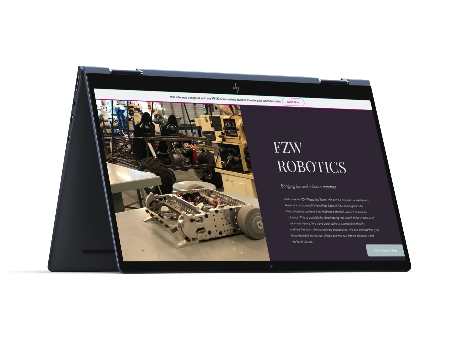
FZW Robotics
This is the first site I ever created! When I was a Senior in High School back in 2019, My Robotic team website was very lackluster. This along with needing to find a better way to show the benefits of becoming a sponsor for our bot led me to create this site.
We didn’t have a lot of money at the time, so we needed a professional-looking site that was low-cost, which led me to Wix.
I honestly believe that my love for UX originated without even knowing it. If I had, maybe I could have saved myself all the confusion in college before deciding to leave and go to General Assembly for UX Design. Anyway, let’s talk more about this project!
If I were to go back and make changes to this site, on the home page I would make some of the text more legible.
There is a certain section were text is over a photo, and it makes the text harder to read.
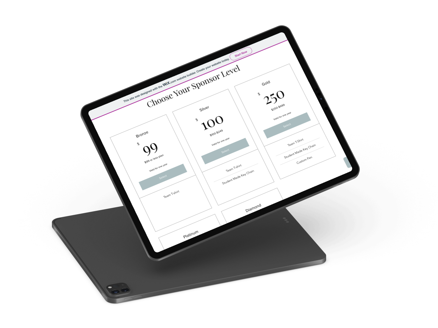
Again, as I mentioned before, we had sponsors to help fund the different parts for our bot, which definitely could get pretty pricey.
The club would also have sponsors of all sizes.
Normally, if a letter was sent to somewhere like Walmart, we would receive $100 and that would be the end of their sponsorship, but other places that were on the smaller to mid-size companies would want to become more involved, even some showing up to our competitions.
Those were the companies who typically wanted more information before agreeing to become our sponsor. We also wanted them to know that even if we couldn’t give much, we still wanted to show our appreciation for them being willing to help at all.
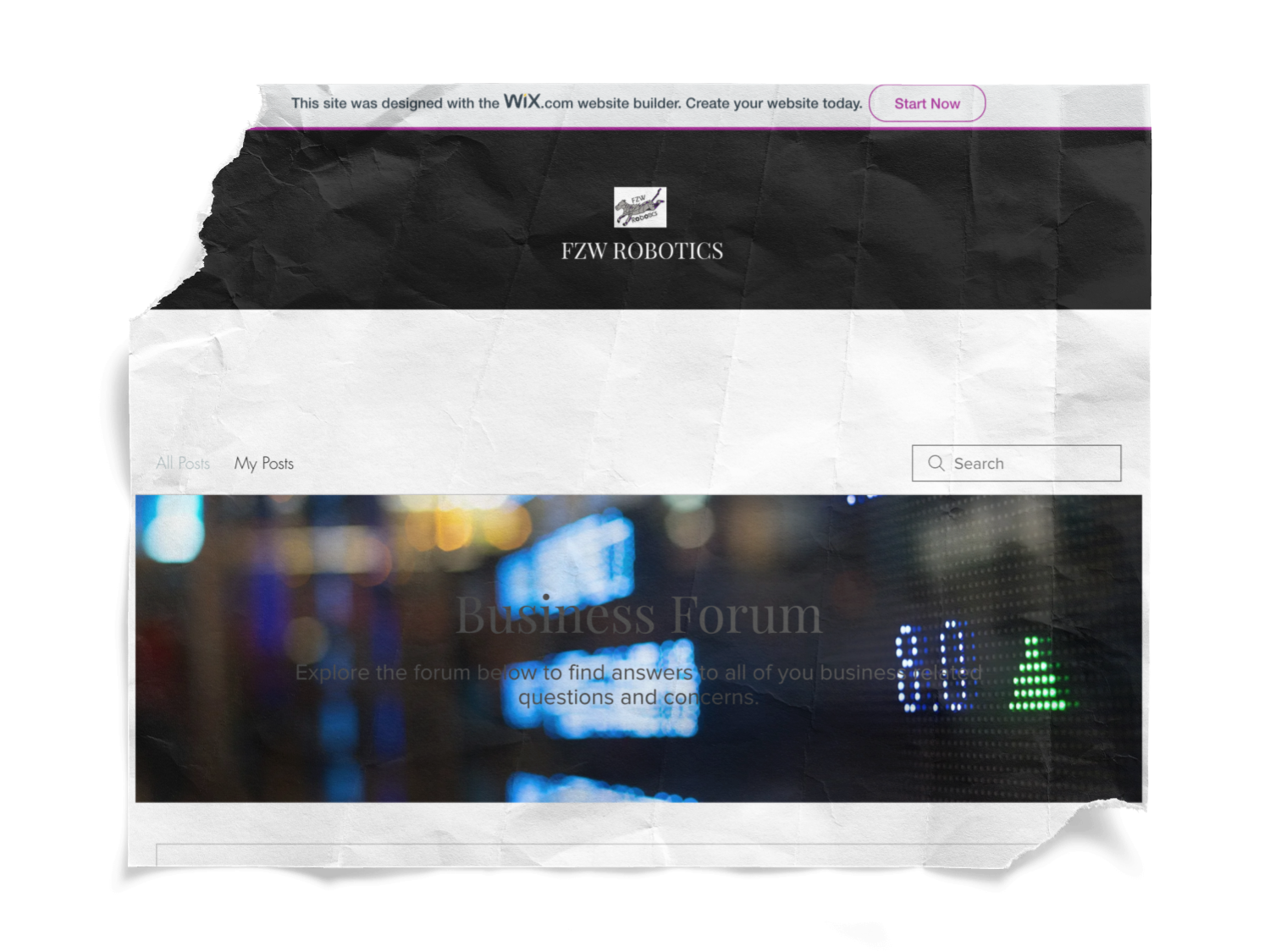
My team also wished there was a way that communication could happen not only with our team but with others from outside of the team as well.
That’s why they asked if I could include a place for forums so that both our teams and others who had questions or knowledge could benefit.
As you can see from this photo, the font color needed some work here too.
Going back that is definitely the area I would try to change the most.
It’s hard to read, most likely making user less likely to have users interact because of it. I also would like to change the size of the search bar to be longer. As it is now, it just feels off and I believe that change could help.
Speaking of how others be able to interact with the club, we needed a system that would allow users, of the club or not, to be able to log in to view previous information or purchases that they have had in the past.
Obviously, we needed an easy way for users to have messages answered. We solved this by having: 1. An Admin Profile to monitor everything. 2. For Admin to answer questions as they arrived.
The easiest way for the second point to be done was to have a chat feature that was available. Looking at the picture to the side. There was a chat that was linked to the Wix account so whoever was running the Admin profile could answer any question from their phone.
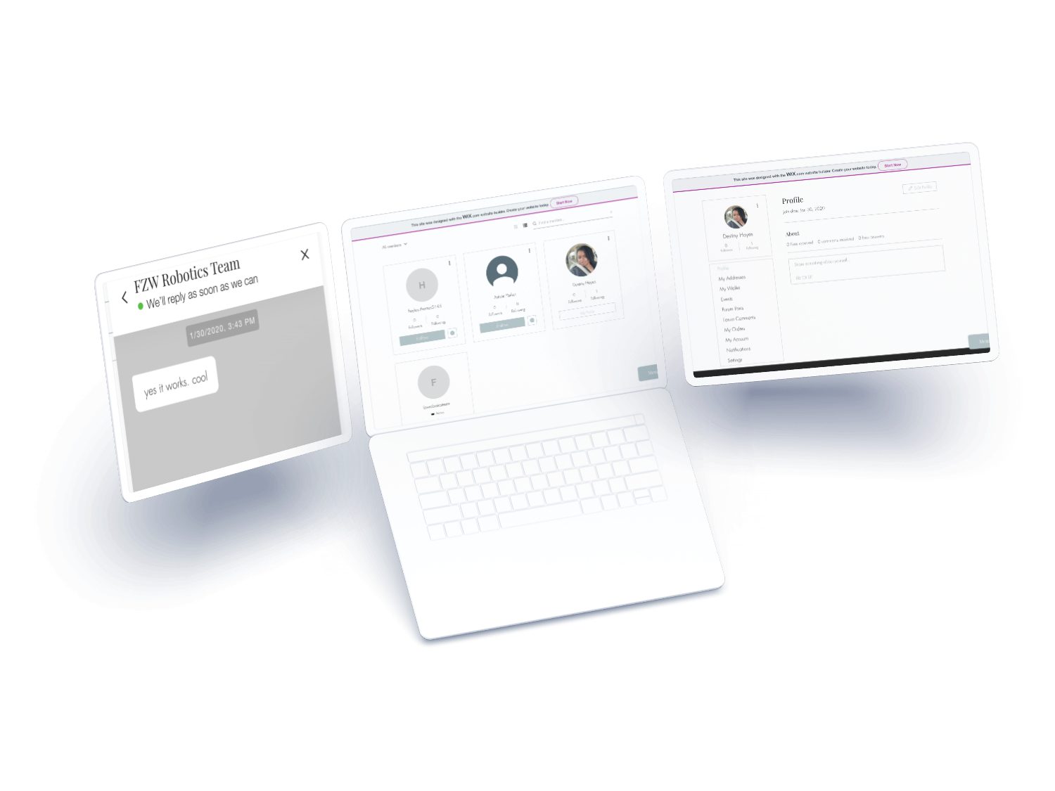
As president of the club and Head of Marketing, that job normally landed me the one to answer any questions that arose, so this was extremely helpful considering I looked at next more than emails at the time.
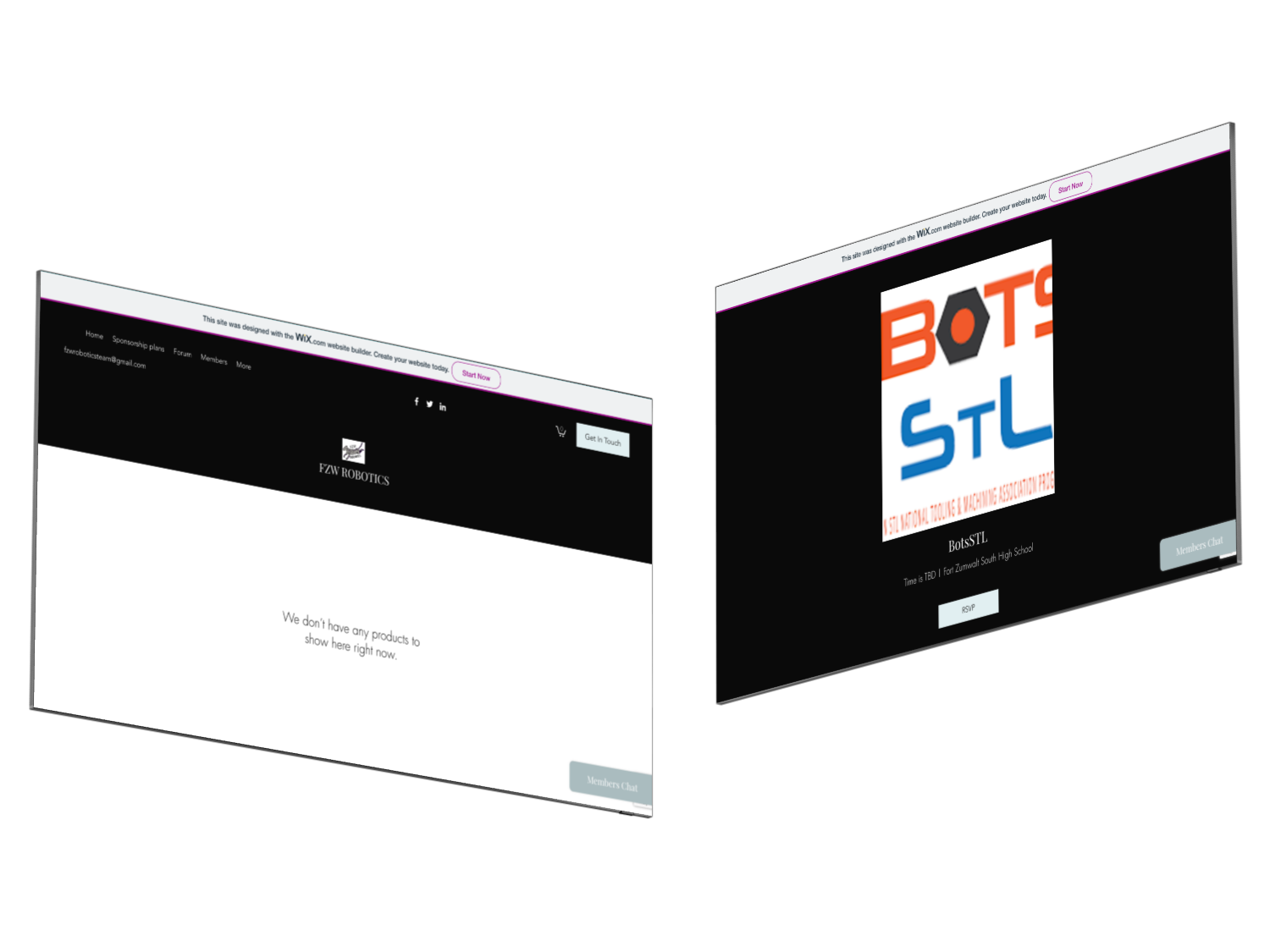
With the site, I also included an area for events and shops.
Events are honestly what it sounds like. It was where all our upcoming events were and was a place for people to RSVP if they were planning to attend.
Since we were a club, Events weren’t mandatory, so having this was an easier way to keep track of who was planning to attend.
For the Shop, we were planning to sell some of the items that were offered to the sponsors like student-made wooden pens, keychains, T-shirts, etc.
Sadly, we never got to fully integrate this aspect into this site.
Unfortunately, our session ended early because of COVID-19, and after spring break, our season ended. The team continues to thrive and now has another active website.
Feel free though to check out the site I made, I have it linked below!