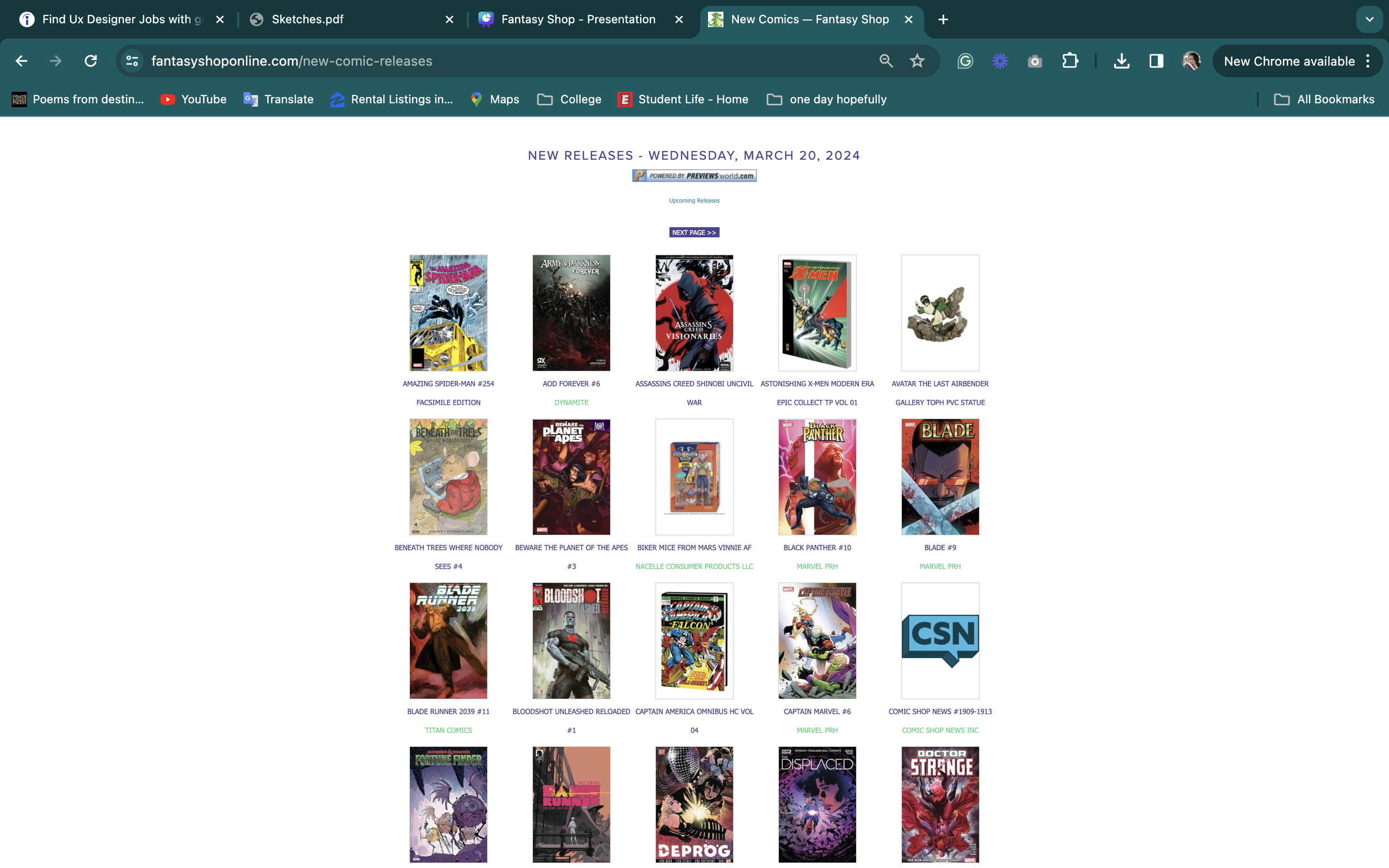
Original
Redesign
Fantasy Shop Redesign:
Key points
Duration - 3 weeks
Tools - figma and FigJam
Platform - website
Why Fantasy Shop
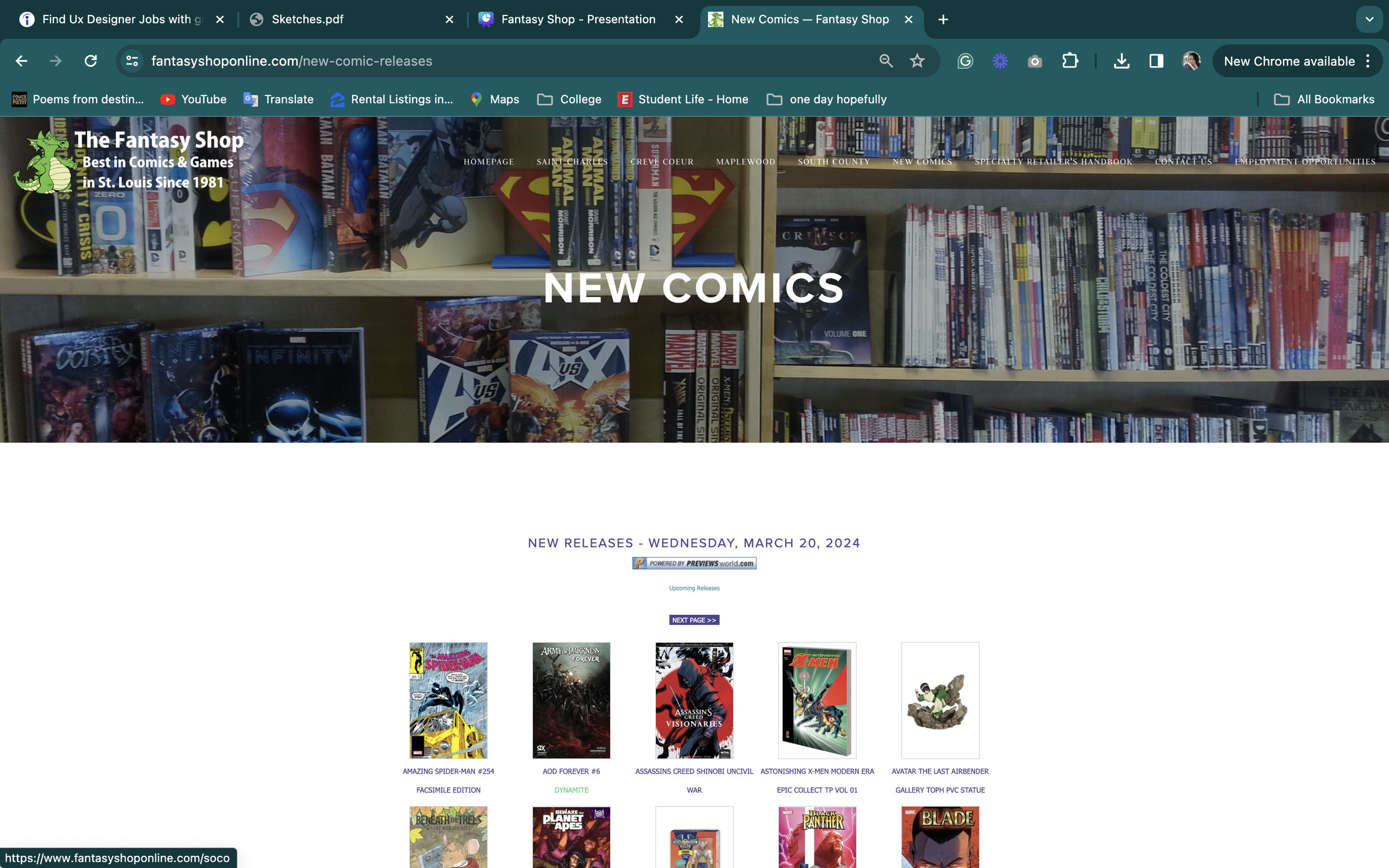
For this project, I got the opportunity to redesign one of my favorite in-person shops. Yes, the actual name of the store is called “Fantasy Shop”. They sell everything from comic books to materials for Dungeons and Dragons, my personal reason for being there. I can truly say that when I am in person, this store brings huge smiles to both me and my friends, along with any strangers we might see while inside. Unfortunately, the online site felt lackluster because of some missed personal elements and categorization. So, I wanted to bring back the joy and excitement that came from going in person to Fantasy Shop.
Research
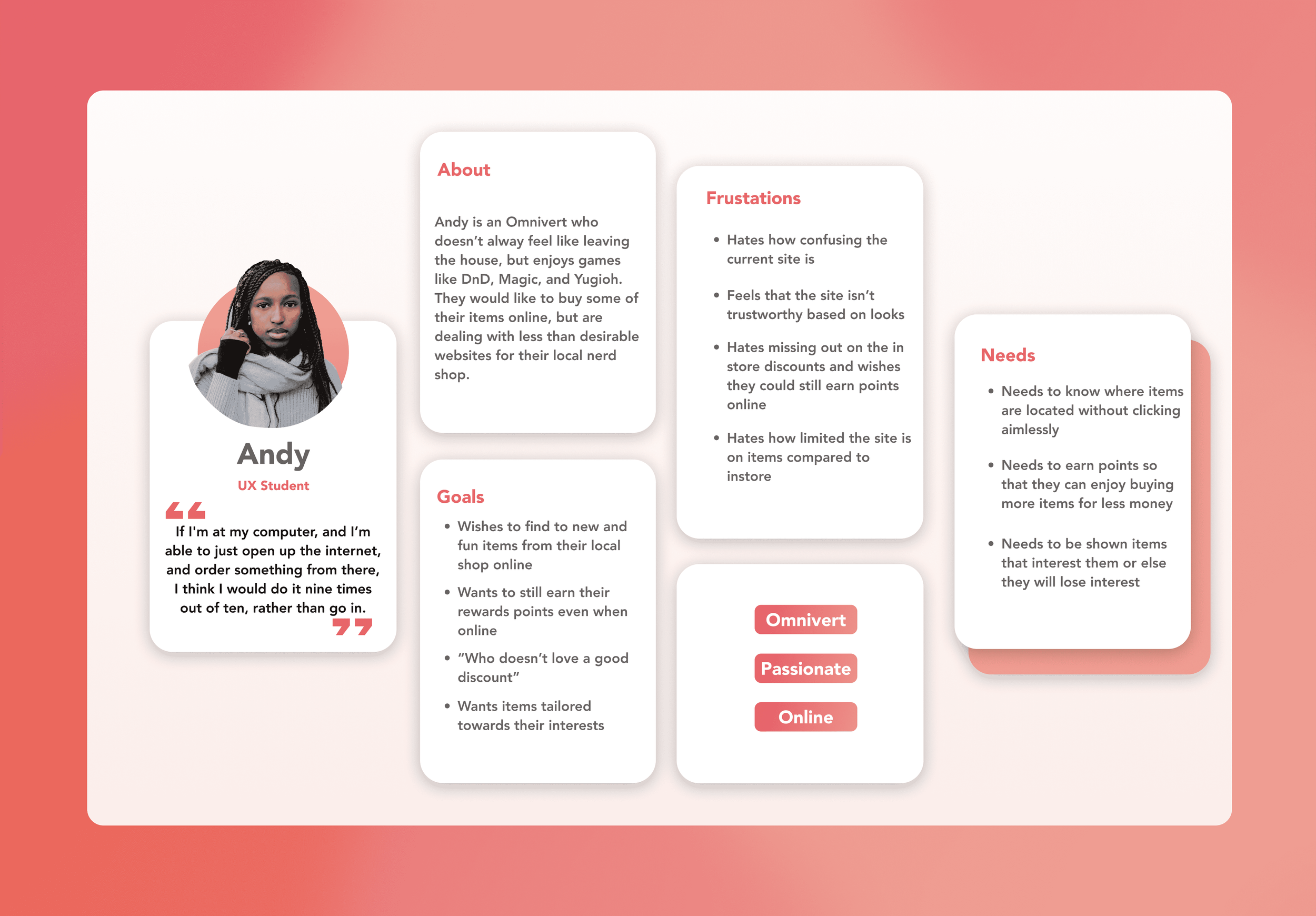
So with all of this in mind, I was able to start creating my personas.
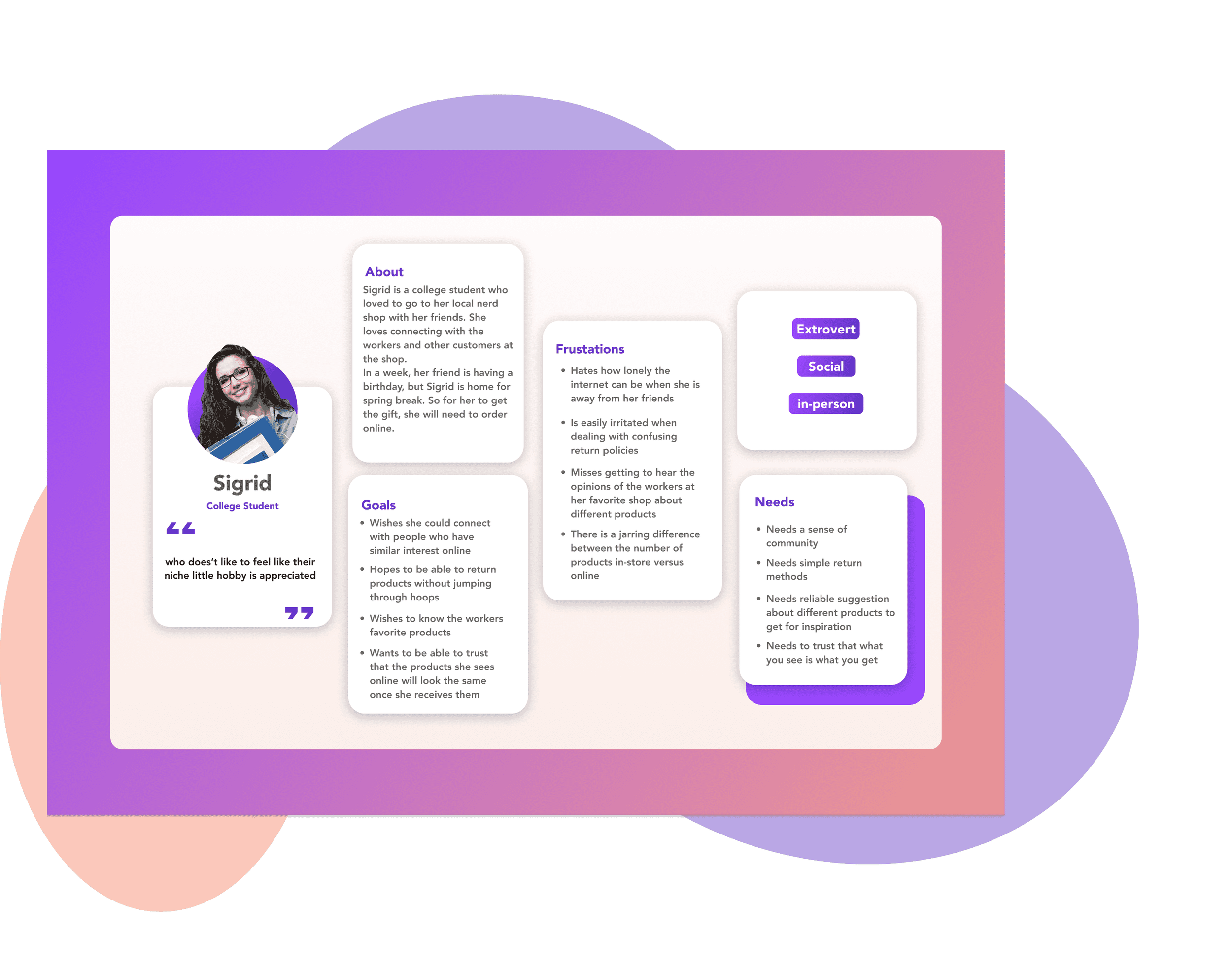
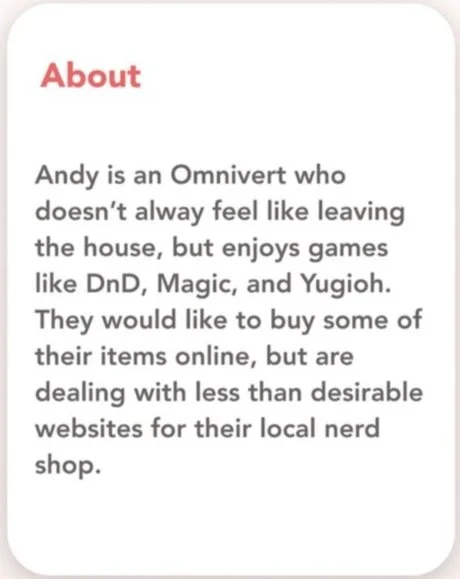
For this project, my main focus was on the second persona that was created. I decided to focus more on Andy because I felt that Andy would be someone who would enjoy online shopping more than in person, as compared to Sigrid who would only be likely to go online if necessary. So why is this? Let’s meet Andy a little closer:
Dream Team:
Dezy Hayes - UX Designer - Solo project
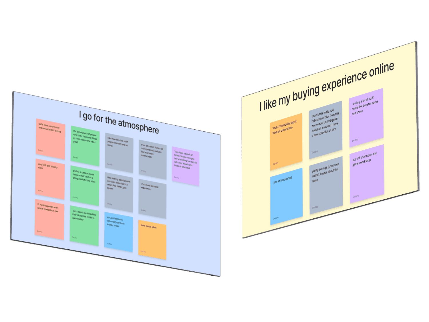
Before moving forward, I knew that I needed research to back up my claims. So I started interviewing and synthesizing information to see how others were feeling. I found that users who enjoyed nerd shops loved the in-person experiences because they could browse different enjoyed items, get to see what the staff members would select, and build connections with other customers who enjoyed similar hobbies.
Before moving forward, I knew that I needed research to back up my claims. So I started interviewing and synthesizing information to see how others were feeling. I found that users who enjoyed nerd shops loved the in-person experiences because they could browse different enjoyed items, get to see what the staff members would select, and build connections with other customers who enjoyed similar hobbies.
Design Goals
So, what were my overall goals for this project?
Enhance navigation
Create trust between users
Increasing ease of use
Having purchases not be redirected
Synthesis
With now having a persona to work off of, I was able to create a story that follows Andy’s journey map of the current site.
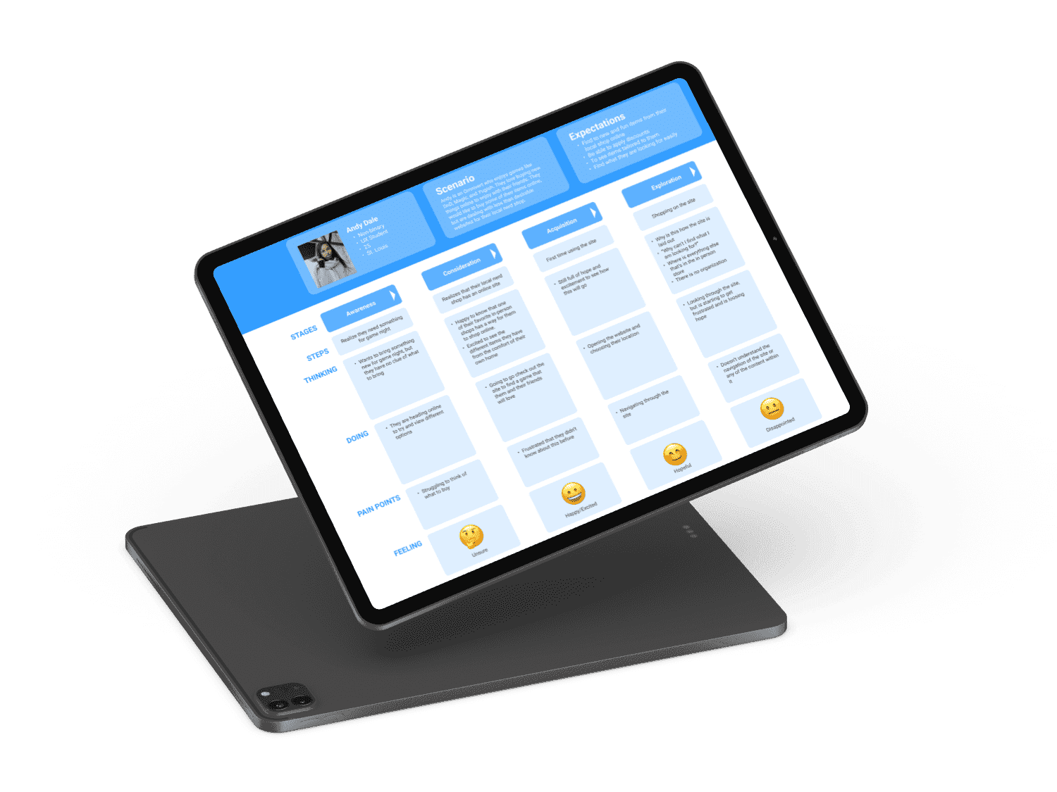
When Andy first found out that their favorite shop had an online website, they were so excited to now have both options to go in person with friends when they felt like it, but also have the option to browse freely online. Once they arrived at the site, they were left confused and dissatisfied. That is what I wish to fix for Andy. So, to gather more information I decided to conduct a comparative and Competitive analysis. Once that was done, I felt like I was another step closer to moving on to designing.
Task Flow
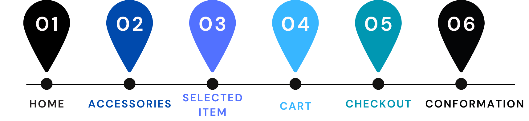
With the information I had gathered up to this point, I was able to understand the flow I wanted to follow a little bit more.
This task flow allows users to fully checkout and have items shipped to this.
Design
Wireframes
Once I had settled on my task flow and created sketches I knew I had a good idea of how I would like the new Fantasy Shop to look. For inspiration, I used sites such as Hot Topic, Ikea, Walmart, Amazon, and Target. Being able to pull from these sites helped me greatly in creating a user-friendly/familiar feel.
A few wireframe highlights include:
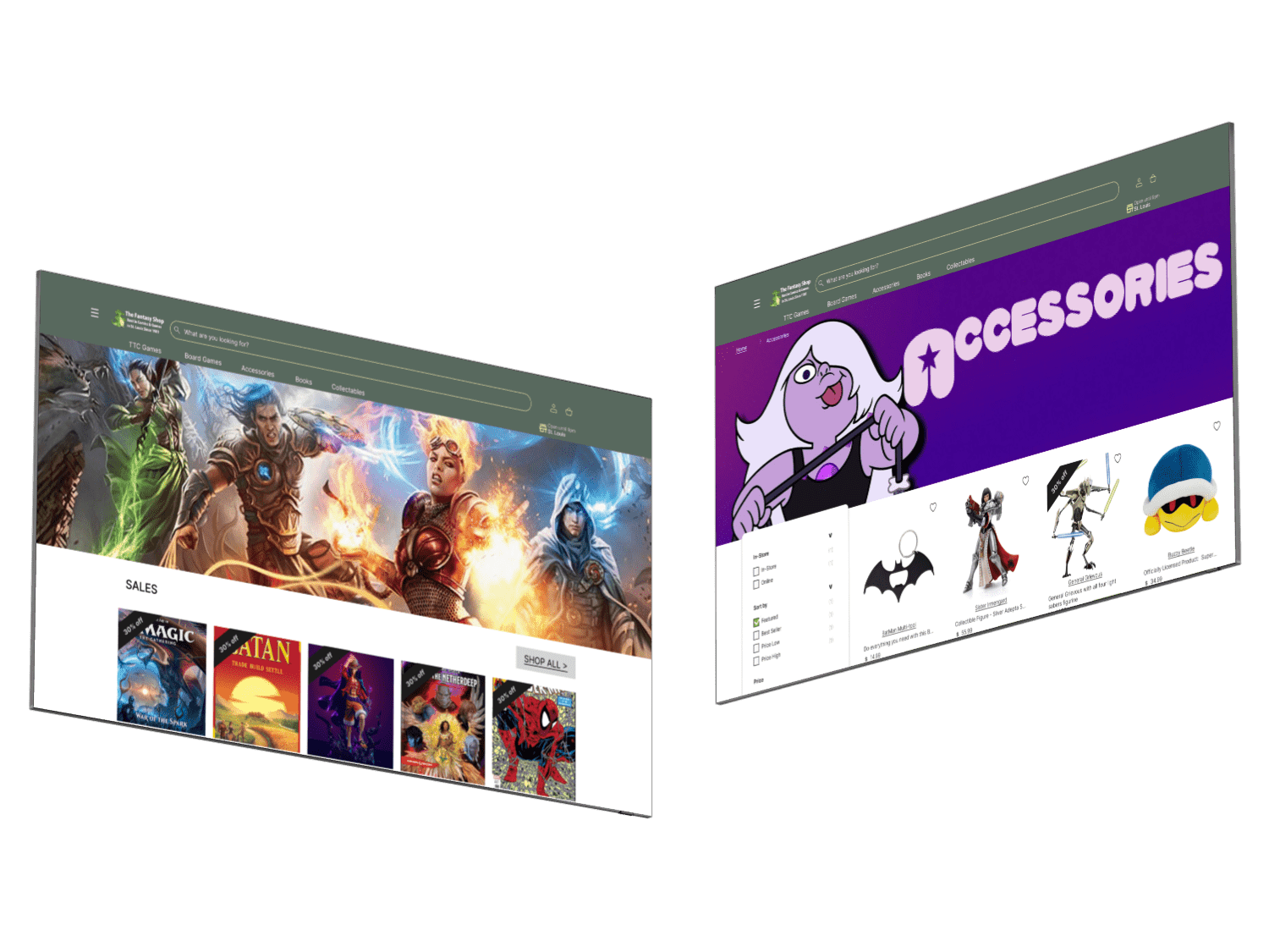
Navigation:
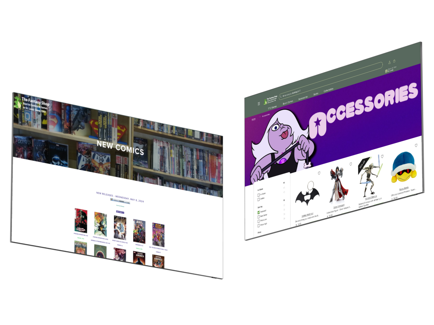
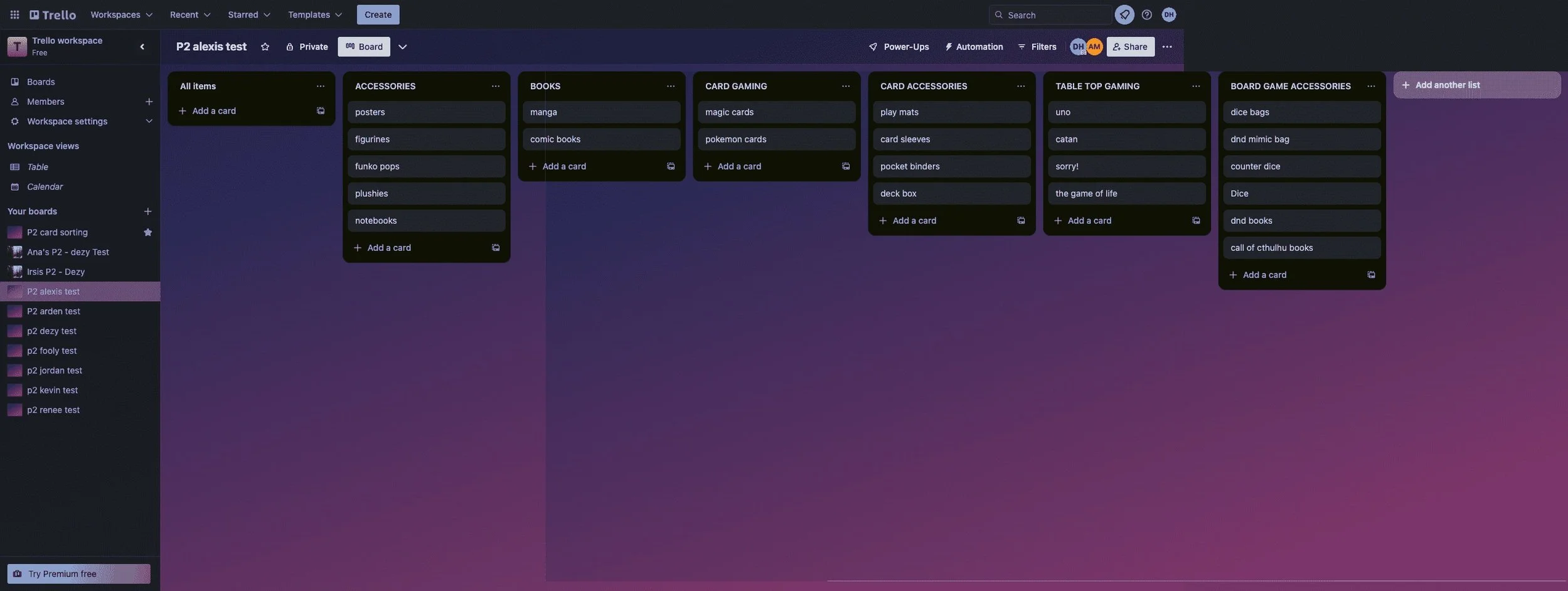
The navigation bar was designed after IKEA's navigation bar. For what I included on the bar, I conducted open card sorts to see what categories users would make, and where they would put different items. I feel that nerd shops can be especially confusing, so I wanted to see if users' answers would line up.
Home Page:
Designed after Hot Topic and Ikea in many ways. On this page, I added categories that users could search items by. I then included an area to see staff picked with images of the staff. A quote from that staff member also accompanied each photo. This was to add personal elements back into the side. I also added a banner on items picked by specific staff members, so if there was a staff member whose opinion someone valued based on personal interaction or even the quote left by staff. The images used were actually of people I got to interview. I asked if any of them would be okay with using their photos first. The quotes that follow were also made by the interviewees in the photos. For the items I decided to use, I asked each interviewee what was their favorite item so the banners were accurate. I also wanted there to be areas where items/categories would be selected based on whether the user used the site often enough. These include the “Toped picked for you” section and the “Recently viewed” section. If I were to proceed with phase 2, I would also build out how the rewards system and what a profile would work. I alluded to it in the design, but sadly since I was on a strict timeline of 3 weeks, it wasn’t where I prioritized my time.
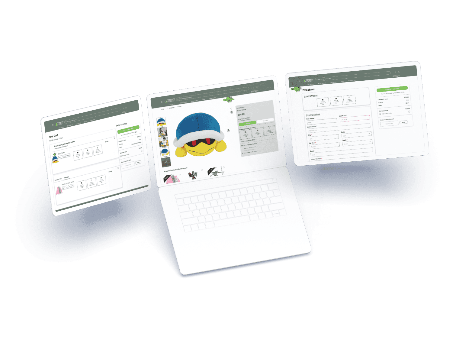
Product List:
I based this page mainly on Hot Topic as well. The sidebar navigation was the main area I wanted to build out because the original site lacked any. The items on the page also included ratings, an “add to cart” button, favorites, price, and name.
Fun additives:
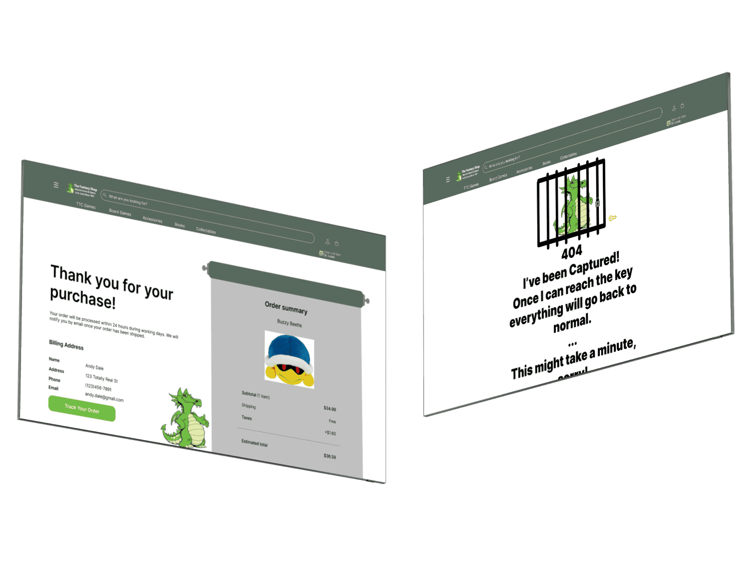
Fantasy Shop’s logo, the dragon, can be seen slightly hiding on every page. I called the shop to see if the dragon had a name. It turns out his name is Wallace. When you click on Wallace, a fun surprise shows up that says “You Found Me!! Yay!!”.
On the confirmation page, the scroll that shows the receipt was completely handmade.
If areas aren’t fully built out, it will take the user to a 404 page I built it out when I took a small break from work, but I still wanted to be learning.
Usability Test
Outcome
Everyone passed with flying colors. The times ranged from 1.01 minutes to 2.16 minutes. The only complaint brought up was that when selecting if you wanted an item shipped, delivered, or for pickup, users had to select the item 3 separate times. To combat this, I made it so it was already selected after the second time.
HiFi
This time was mainly spent cleaning up different areas of the project and getting the prototype to function properly. When duplicating my files to make the hifi, more than half of my prototyping was lost. In order to not replace everything within my prototypes, my wireframes became my hifi and vice versa. Besides that, everything everything else was smooth sailing.
Reflections
I feel like the main goals of the project were fulfilled. I would love it if this could be the actual site because the functionality is more user-friendly compared to the current site.
A reminder of the goals:
Enhance navigation
Create trust between users
Increasing ease of use
Having purchases not be redirected
Journey Map
Before moving on to Hifi, I wanted to see if any major changes should be made, so I conducted a few usability tests.
The goals were:
Choose a category
Select an item
Add the item to cart
Go to the cart
Checkout and make it to the confirmation page
Do everything in under 5 minutes
Key points
Duration - 3 weeks
Tools - figma and FigJam
Platform - website
Dream Team:
Dezy Hayes - UX Designer - Solo project